Sage
Course management mobile app
The problem
My role
As a one-person team, I set out to create a minimum viable product (MVP) for a new educational app, Sage, which had a unified UI/design system merging usability guidelines and aesthetic appeal.
Online learning platforms are essential to the daily lives of students enrolled in secondary and tertiary education around the world.
However, the current apps on the market are outmoded and unintuitive, with UX that falls short of user expectations; additionally, most of them have aesthetically unappealing UI. An overhaul of these apps feels long overdue, and will help ensure that students of a variety of backgrounds feel supported and challenged while embarking on their educational journeys.
Introduction
I led the entire project and worked on creating the visual design of the new UI/design system. By the end, I had devised a prototype for the red routes of a brand new, cutting-edge educational app. My process involved:
A problem statement (see above)
Personas
Sketches
Lo-fi fireframes
High-fidelity mockups
Extensive user testing
A final prototype
Research
“Divide the course content into weekly modules, including an introductory module (or module 0). An introductory module establishes a framework for introducing yourself to your students and explaining why you are so passionate about the discipline and course.”
Helpful features of existing EdTech products
Being able to see classes separately and being able to view the stream of each teacher (Google Classroom).
When you miss an assignment it tells you that it's missing and shows up in a missing column (in Google Classroom, unlike Canvas).
Calendar (Moodle), very helpful in terms of compiling all your listed assignments.
I used UTexas as another educational app, and for chemistry and math, you'd have to do the problems online. The tests were based on the same kinds of problems, so what you would do was just keep refreshing your homework so you could keep getting new problems when you were trying to study.
I have live grading in Canvas. I think that part is useful. I don't really have any issues with it. If it was more customizable to fit the grading scheme of the class, it would be better.
…and more
First, I browsed published secondary research in academic journals, (below) which demonstrated that there was a very high ceiling for possible improvements to existing educational apps.
These research papers confirmed for me that many students do in fact struggle with engagement and motivation issues while utilizing online learning resources.
“Post structured online discussion boards. Since discussion boards are commonly used in hybrid learning, such as flipped classrooms, to introduce students to course topics, the key is to make them meaningful, relevant, and instructive so that students see them as essential to the learning process rather than busywork.”
“56% of online students surveyed by Statista cited the lack of personal interaction and engagement as a significant concern.
42% reported difficulty in staying motivated and focused as a concern.
33% expressed concerns about the potential for limited networking opportunities.
32% mentioned concerns about the quality of online education compared to traditional in-person learning methods.
28% expressed worries about the credibility and reputation of online educational institutions.”
Second, I interviewed real students (below) and synthesized their words using a journaling thematic analysis. The interview participants expressed to me what they liked and did not like about existing educational apps, such as Canvas, Moodle, Google Classroom, and Duolingo.
They also told me about nonexistent app features that they wanted to see realized.
The notes I took during these interviews were indispensable for my final design, which avoided the pitfalls of existing apps and built upon their best features.
Ideas for new features
Google Classroom: Make it easier when you want to edit one of your assignments – make it so that if you have to resubmit it after the deadline, it doesn't say that it was "late." So if you turn it in a day before the deadline, and go back to edit it – like, if the teacher told you to edit it, or something – it doesn't mark it as late, because it wasn't actually late
Live grading would be helpful. I've used outside apps before to calculate how much a weighted grade would be, and I think it's fine. It probably makes people feel better if they're very anxious people and they want to know if they'll pass the class or get the grade they want.
A math problem generator would be great, because sometimes the teachers don't give you any. But it would have to show you exactly how the teacher did it so they wouldn't get mad if you did it a different way
I don't have live grading in Moodle – it doesn't do it accurately. I'd like to see that, though – it'd be good to have.
…and more
Unhelpful/challenging features of existing EdTech products
D2L: I just don't like how responses work because it doesn't give you a notification when someone responds to you. But it's better than Moodle overall.
Canvas: too complicated and there's just too many buttons
Moodle: I don't like the listing of classes, because in the past, I can't find a class unless I look up a specific word. It's difficult to navigate. Not great for easily accessing classes you're taking. It says "recently accessed courses at the top," but you should be able to bookmark or favorite your courses.
Quizlet: It's easy to use, but some things are not so intuitive, like creating a new set. Sets that are already created are a little confusing at first to figure out how to edit to add more. I think I had an issue when I wanted to take the set that was created by my class and wanted to save it as my own.
Duolingo: For Duolingo, sometimes what they're trying to teach is not actually explained, so I wish they gave explanations more often.
…and more
Personas
Based on my research, which surveyed individuals of a wide range of backgrounds, I sought to create a diverse group of personas that reflect the diversity of students in the world today. Some are enrolled in secondary or tertiary education, some of them are casual learners, and all of them occupy different stages in life.
User stories
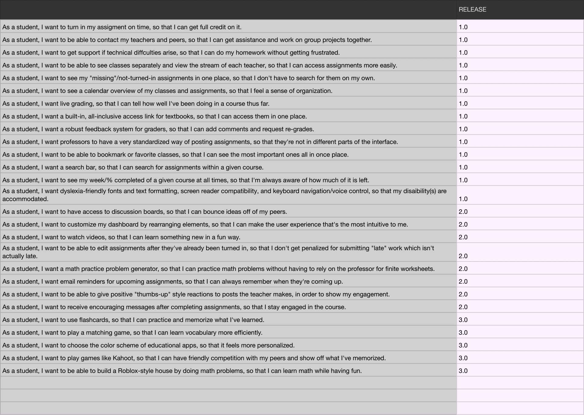
I documented user stories in a spreadsheet with the understanding that an MVP is a product that contains the minimum set of features required for an early customer to accomplish their primary goals and tasks. By focusing on these essential features, the MVP allows for efficient product development, early user feedback, and iterative improvements based on real-world usage and customer insights.
In this context, the user stories I captured aimed to identify and prioritize the critical tasks and requirements that would provide value to the target users from day one. Each user story followed the standard format: "As a [user role], I want [desired feature or functionality], so that [benefit or value]." This structure helped maintain a user-centric perspective and ensured that the MVP's features directly addressed the users' needs and desired outcomes.
Sketches
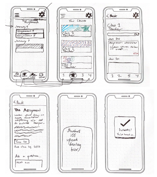
Armed with plenty of information from my research, I sought to design a new educational app from scratch. Initially, I focused on only a couple of specific use situations – 1) turning in an assignment and 2) accessing an assigned reading. I incorporated several discoveries from my interviews; for example, the page for an individual course includes a search bar. One person interviewed was disappointed that the educational apps she used lacked this function.
Next, I “guerrilla tested” these screens with people I knew in real life, with a prototype I created using the POP app. At this point, there were no apparent usability issues.
User flow
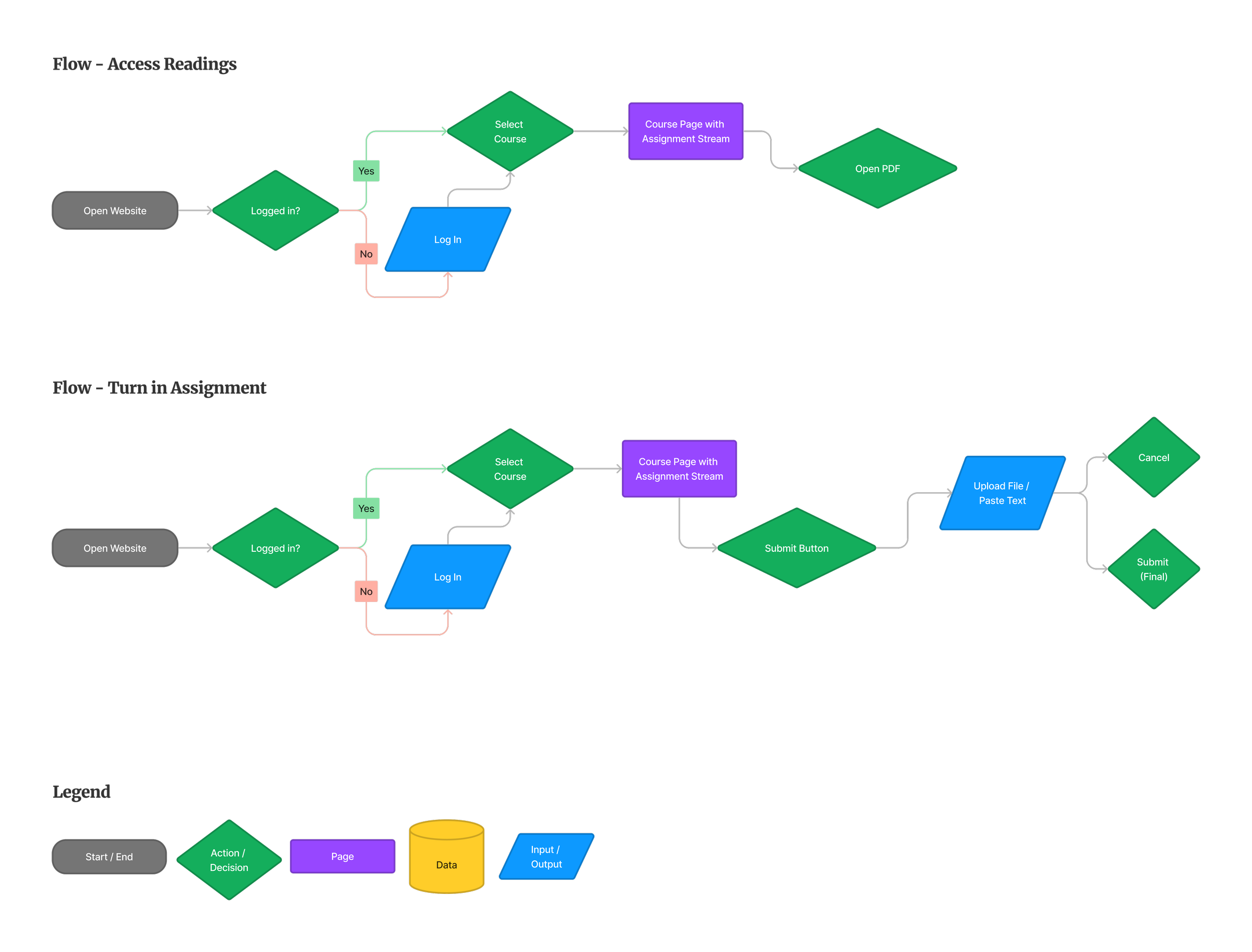
I made user flows for two of the app’s critical red routes – accessing an assigned reading, and uploading and turning in an assignment. These helped to guide my design efforts going forward.
Wireframes
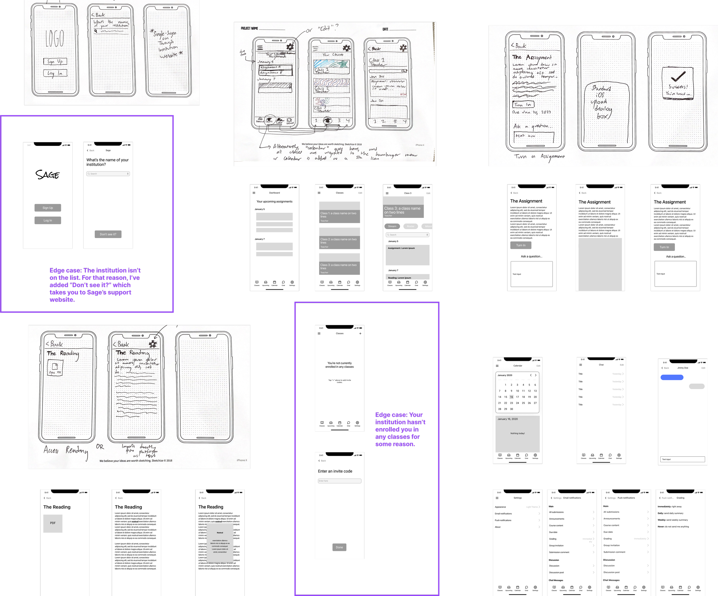
After testing out the sketches, I made low-fidelity wireframe versions of these sketched screens, in addition to several additional screens that I had not initially drawn.
The Figma artboard below demonstrates how the sketches turned into wireframes. Making these wireframes was a continual process of discovery: for example, I added a series of “tabs” on the course page discussed previously, so that the student could access different pages pertaining to the same class (latest assignments, missing assignments, class roster, etc.)
Visual design
I sought to create a unified design system with the following attributes:
Bright yet muted colors to appeal to all ages; approachable and friendly, but not too playful.
Earthy/earthen aesthetic, to be used in both the application itself and the marketing materials.
Sleek, uncluttered, ultra-modern user interface design with a focus on the colors green and white.
Before
Final high-fidelity mockups
After
High-fidelity mockups
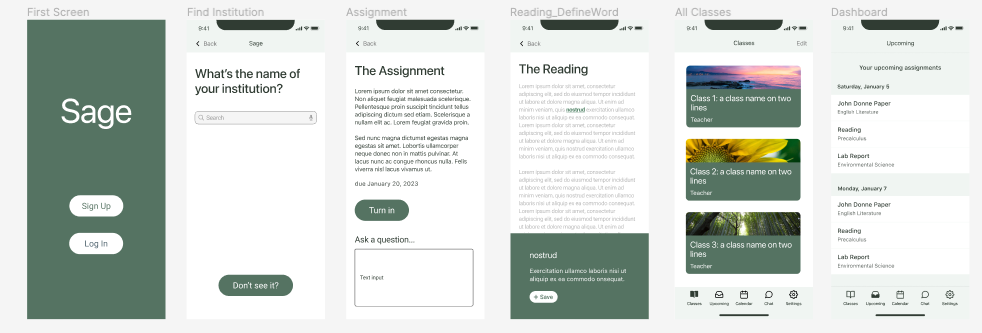
Making these was a continual process of iteration. The initial high-fidelity mockups I came up with were rather unappealing, with too many bright colors, overly rectangular buttons, and a distracting modal; it took me several tries before I came up with the sleek, unified designs you see in the second group of images. I followed minimalist design principles, and sought to create designs that both pleased the eye and were easy to navigate.
More testing
During another round of testing, several key findings emerged. (See the “before and after” in the two images below).
The page titled “Upcoming,” which only lists upcoming assignments, was originally titled "Dashboard” (before). This was found to be misleading, as it did not fulfill typical dashboard expectations of having multiple modules, and it was thus renamed to “Upcoming” (after).
Participants suggested making "Classes" the default opening page instead (originally, it was “Dashboard”).
Some users expressed confusion over the drop-down menu on individual class pages, because the default page was titled “Stream,” a word that was not very descriptive (before). This was changed to “Class Stream” for the sake of clarity (after).
Participants highlighted the importance of displaying the day of the week alongside assignment dates for better clarity (after).
The change to more muted colors (after) was suggested by my mentor.
Result
A final round of testing was conducted, after feedback had been implemented. Participants in this last round of testing expressed a very high degree of satisfaction with the design, and no issues were detected. A few participants remarked that our app felt superior to the educational app they currently used on a daily basis.
The design process that I’ve described in this case study was an eye-opening learning experience for me, and I could potentially test the design with even more participants to uncover further improvements. For now, however, the product is ready for consumer use.


